UrbanPulseReal-Time City Intelligence Platform

A data platform that turns fragmented public mobility, weather and environmental feeds into a coherent real-time view of the city.

Explore the architecture
  • Data Engineering
  • Product Engineering
  • Built locally · 2026
URBANPULSEPARIS22 SEP 2026PROTOTYPE
CITY OVERVIEW

A clearer view
of the city.

84City Pulse
Illustrative index
WEATHER21.8°CClear skies
AIR QUALITYGoodModeled air estimate
AVAILABLE BIKES2,418Across the network
CITY LAYERSMOBILITY · ENVIRONMENT · WEATHER
DATA FRESHNESS 28 SEC48.8566° N, 2.3522° E
An editorial view of UrbanPulse's city signals. Values here are illustrative.

Cities generate signals. Pipelines give them context.

Weather, mobility and modeled air feeds describe the same place, but arrive with different schemas, clocks and locations. UrbanPulse turns those signals into a traceable city view.

01WEATHER APIHourly conditions
02MODELED AIR DATACAMS estimates
03GBFS FEEDSStation status
THE INPUTS DO NOT AGREE
SCHEMADifferent fields
TIMEDifferent intervals
SPACEDifferent locations
TRUSTDifferent reliability

One city. Many signals. One data model.

Python adapters retain raw payloads before normalization. Kafka and Airflow support streaming and scheduled paths in the optional platform stack; dbt defines the marts that power bounded API responses.

01 / SOURCESPublic feeds
WeatherAir qualityMobility / GBFS
02 / INGESTPython adapters
Kafka · streamingAirflow · batch
03 / RETAINRaw objects
S3 / MinIOOriginal payloads
04 / MODELPostgreSQL + PostGIS
dbt · stagingFacts · dimensions · marts
05 / SERVEFastAPI
Bounded analyticsNext.js / TypeScript UI
REPRODUCIBLE LOCALLY WITH DOCKERRAW → TRUSTED → EXPLORED
The built data path. Kafka and Airflow are enabled in the optional platform profile.

From raw event to useful signal.

A GBFS station update becomes a historical snapshot, then a queryable measure of availability. The same pattern brings weather and modeled air data into consistent facts and dimensions.

01
RAWGBFS station_statusProvider payload, kept intact
02
NORMALIZEDstation · time · locationAvailability and capacity in one schema
03
MODELEDfct_mobility_station_snapshotsHistorical facts with spatial context
04
ANALYTICALUtilization · trend · healthDefined metrics for the interface
DIMENSIONScity · station
FACTSweather hourly
air quality measurements
mobility station snapshots
MARTScity hourly
environment hourly
mobility hourly
A simplified dimensional model, not a full database schema.

The city becomes the interface.

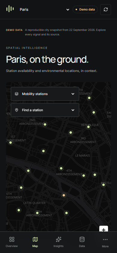
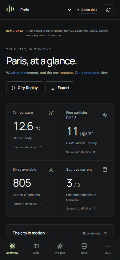
The built app uses a fixed, labeled demo dataset by default. Maps and focused metrics make its infrastructure approachable; on mobile, station details move into a touch-friendly sheet over the map.

Built UrbanPulse desktop overview showing the Paris demo dataset, source definitions, city metrics, and map
The built UrbanPulse overview, using its labeled local demo dataset.
UrbanPulse mobile overview with Paris weather, modeled air, bikes, and bottom navigation
UrbanPulse mobile city map with station markers, layer selection, and bottom navigation
The real mobile overview and map, with distinct navigation and touch layouts.

Replay makes time visible.

City Replay steps through historical snapshots so changing station availability, air conditions and weather can be explored together. Try the timeline or select a map layer and location below.

URBANPULSEPARIS  /  CITY REPLAY
22 SEP 2026 · ILLUSTRATIVE DATA

Watch the city change.

City Pulse81
SELECTED LOCATIONRépublique27 / 42 bikes available
14:0014:0020:00
Weather 21.8°CAir GoodBikes 2,418
Interactive City Replay prototype using sample data for 22 September 2026.

Show the state behind the metric.

Freshness, job health and quality checks belong beside the analytics. A reader should be able to trace what they see from API response back to its source.

PIPELINE MONITOR03 / 04 healthy
Weather ingestion42s agoHealthy
Mobility snapshots1m agoHealthy
Air-quality ingestion12m agoWarning
Analytics marts3m agoHealthy
LAST WEATHER RUN 4,320 rows1.8s duration
DATA QUALITY15 checks
mobility_freshness_within_thresholdPASS
station_id_unique_per_snapshotPASS
station_capacity_consistentPASS
mobility_timestamp_not_nullPASS
14 passing0 warnings · 1 failing
An illustrative monitor view; job values shown here are examples.
Built UrbanPulse quality screen with fifteen executed checks, fourteen passing and one failing in demo data
Executed data-quality checks in the local demo, including one visible failure.
TRACE ONE METRIC FROM SOURCE TO SCREEN
  1. 01Open-Meteo
  2. 02raw_events
  3. 03stg_weather
  4. 04fct_weather_hourly
  5. 05mart_city_hourly
  6. 06FastAPI
  7. 07UrbanPulse
Weather lineage, from provider payload to the overview screen.

Engineering decisions

The stack is organized around reproducible data and small, explainable product responses. Docker keeps local services consistent; Airflow coordinates batch work alongside Kafka streams.

01

PostgreSQL + PostGIS

Relational analytics and spatial queries share one database.

02

dbt

Metric logic is versioned and tested before it reaches the interface.

03

Kafka + raw retention

Events and original payloads remain available for replay and debugging.

04

Server-side aggregation

FastAPI sends bounded results instead of raw datasets to the browser.

Data engineering, all the way to the interface.

UrbanPulse carries ingestion, modeling and reliability into a product people can explore. The project runs locally with transparent demo data; public deployment is the next step.

Explore more projects